Keep it Simple. 5 Surefire Tips for Designing Complex Websites.
As a web designer I’m constantly forced to find solutions for necessarily complex websites. I find myself constantly sourcing ideas from the simple; “simplicity” that doesn’t reduce, but enhances and clarifies what is most important.
The world is a complex place. In an effort to ‘understand’ it, people often attempt to reduce, conceptualize, and simplify everything, including design and ideas about design. But not everything is simple. In fact, arguably, everything is infinitely complex if it is allowed to be. More literally, many web design projects require a more complex structure or high volume of content which without careful consideration can result in websites that are unnecessarily complex due to poor presentation and lack of focus. However, there are principals and ideas we can learn from simplicity when designing necessarily complex websites. Here are five simple web design techniques that can improve designing complex websites:

1. White space is your friend

Giving users space for their eyes to rest, can help them focus and digest more information.
Allowing the content of a website to breathe allows for a more pleasant browsing experience. Sections are allowed to stand alone and communicate their messages independently of unrelated information, and visually it is more pleasant to look at. It is a mistake to think that compactly and more densely presented content is more efficient because it impairs the users ability to discern what they should be looking at.
In the example shown here–Mettā Skincare’s website–everything is afforded a generous, but reasonable amount of white space. Product images are large, because of the white space titles are prominent without being enormous and overpowering, and sections are given large padding and subtle colour variations to help create focus without being imposing. Adding white space creates the illusion of simplicity, allowing users to feel comfortable and better able to digest what is being presented.
2. Put your main message front and centre

Not literally in the centre, but make sure it is immediately obvious what you are trying to communicate.
Your website might have a lot of content that must be included, but every website in the end has very simple goals, so you have to ask yourself: “What needs to be communicated?”. That is the most important question, and the answer should dictate how the content is presented.
One of the easiest and most popular simple web design techniques being used to ensure that your most important message is communicated to users is a statement of intent or purpose at the top of your website below the menu. The example shown here–the website for Obsurfation, a web app which allows you to find surf, wind, tide, and weather for local beaches–employs this convention to perfection, immediately stating “Explore conditions at your local beaches and waterways”, and then taking the extra step to include a search bar so that without even one scroll, users can both understand what the purpose of the website is and begin using it as well.
3. It’s OK to hide content
Consider how important each piece of information is: emphasize what is most important, downplay, or even hide what isn’t.
In considering what absolutely needs to be communicated to ensure users understand who you are and what you want them to do, it should become apparent that all “necessary” information is of course, not necessarily important. With this realization in mind, it should be considered: “How can I simplify this website without removing content?”.
One way of doing this is to hide information/content that does not need to be displayed by default. If you know that it is likely for a user to interact with a particular element on a site, hiding extraneous pieces of information when they are not necessarily needed to preserve the simplicity and integrity of the design by allowing the element to initially speak for itself is an effective way of minimizing the visual density of any given page.
The example shown here, the website for TSOVET, a California-based watch maker employs this idea in several places:
a. Hidden Product Number/Price
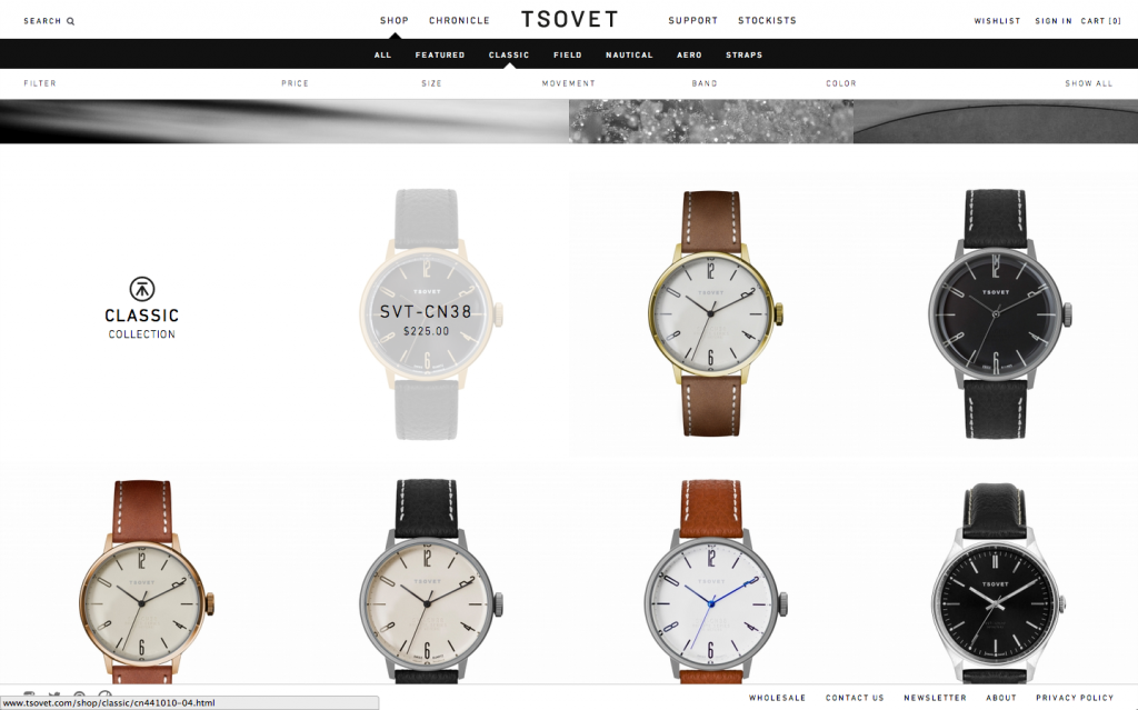
In their shop, the product number and price of each watch is hidden until you hover over it. This allows for users to focus on the design of each watch without being distracted by additional, arguably initially unnecessary information.
b. Hidden Share Icons
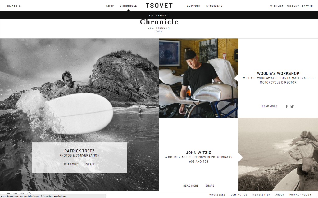
On their “Chronicle” page, each article has the text “Read More” and “Share” beneath the title. Hidden behind a hover effect are Facebook and Twitter icons, which replace the “Share” text. The Facebook and Twitter logos are part of separate brands, so by hiding them behind the hover effects, TSOVET is protecting the integrity of their own brand by hiding elements that refer to things outside of themselves at first glance. The design is also cleaner this way, and creates better focus on the titles and images, rather than the icons, which do distract from everything else in a small way.
c. Hidden Additional Product Information
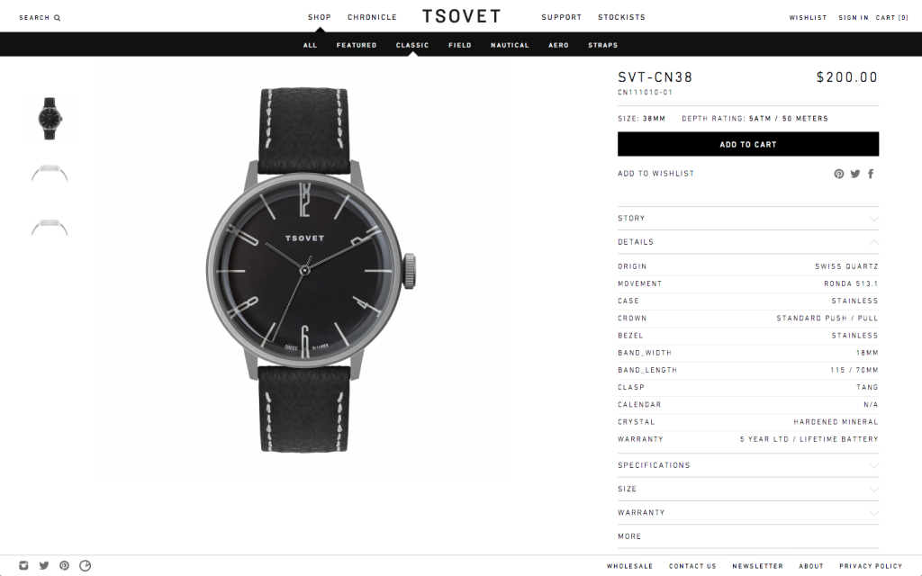
The product description pages have additional details, specifications, warranty information, and more hidden behind drop downs.
One of the other simple web design techniques being used lately–not seen on TSOVET–is the use of the mobile menu icon at full width, like on Kalyn Nakano’s website. This effectively declutters the header. If the interior page content or additional links are not of huge importance, this idea is something to consider implementing.
4. Simple is good. Standardized is great. But adding a twist makes things even better.

Find the right balance between meeting user expectations and taking risks to make your design stand out.
It has been argued that people prefer simpler websites to complex ones. People also prefer if those simple sites feel familiar to them. Ie. if you’re designing a restaurant website people will be more likely to respond positively to your design if your site feels like other similar restaurants sites. As designers, we’re constantly fighting the urge to do the opposite of the ‘same’. So we should look to find a balance where we respect the simple, or the similar, but find ways to improve – through subtle surprises, or twists we can find ways to create even better designs. Meeting user expectations completely and absolutely neglects the importance of being or appearing to be different enough to stand out and be memorable.
One great example of how you can stick to what works but still make a lasting design impact is the website shown here for the luxury brand, Kenzo. In this instance, the logo very simply aligns itself above whatever page you are browsing. This might be ‘wrong’ for a conventional thinker, who might think that the logo absolutely must stay in one place on any given website, but in the end it doesn’t really impact the usability of the site and only serves to say something–even if it is subtle–about the attitudes of the people who work there. It’s easy to take ‘rules’ for granted, and as a result not consider how easily they can be broken to great effect without being disorienting for users.
5. Clever animations bring your site to life and can keep key content accessible

Animations can simplify pages and engage users visually, investing them to a greater extent in the experience of browsing.
Perhaps because it is easier to spend time on this kind of thing when designing simple websites, they are often characterized by clever, though sometimes subtle animations. On the site for Guided, travel guides by Cereal Magazine, the menu beautifully minimizes shortly after you begin scrolling.
Animations or transitions can have two effects on a website: some draw attention to particular elements or content, while others help to keep key content accessible like in the example shown here where the menu/header simplifies to make more room for the content of the website. In both cases your site becomes more than just a static page to scroll up and down on; users become engaged with your site and the content regardless of how complex or not it is. Animations and transitions or effects like parallax scrolling breathe life into your web design, and if implemented correctly like on Guided, add a quiet, understated elegance as well. Small details like this can add up to have a huge effect on the experience of browsing a website.
Complex websites often must place the bulk of their efforts on efficient presentation and structuring of information. These things are surely important, but they shouldn’t take away from the importance of putting effort into the feeling of the site on a visceral level, into the experience of browsing a site. Simple web design techniques and ideas like these can improve our designs in any context; whether complex or simple. Failing to do so may deter users from interacting with the website to some degree, no matter how great the content itself is. Content may indeed be king, but if that’s true, then design must be queen.
Alright you Pinaholics, here are some full-length site images to pin to your inspiration boards. Enjoy!


