F the grid. Discover ways to improve your grid based website design.
Life is a constant balance between structure and freedom. Most people can’t live exclusively with one or the other, and the same can be said for web design. Designing based on complex grids, structures, and sharp squares and rectangles helps to give stability to a website, but structure alone is not enough. ‘Content’ alone is not always enough. It’s also important to consider what a website communicates before users interact with the content; if it is visually dynamic and appealing, they will be more likely to stick around.
That being said, maintaining some sense of continuity and structure is important in most situations, so how do you break the monotony without breaking the grid? Here’s eight great examples of how to improve your grid based website design:
1. Transparent/Overlapping Elements
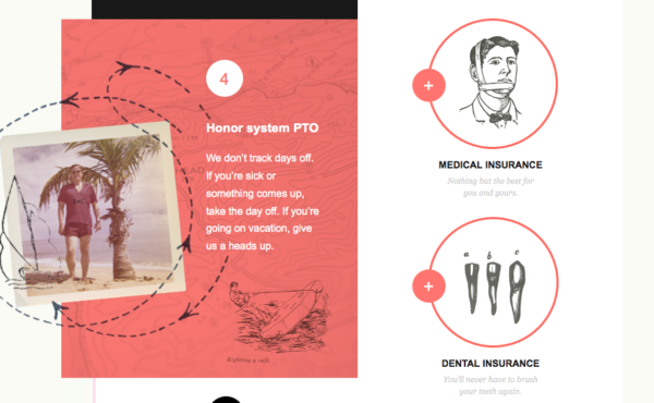
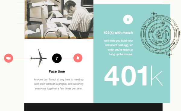
Overlapping graphic elements like the photograph and illustration shown in the examples above from Big Cartel, are a great way to not only generate visual interest through having things ‘softly’ break the grid, but also a great way to generate visual cohesion and flow from one section to the next.
2. Bordered Sections
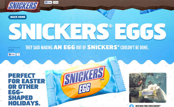
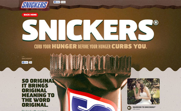
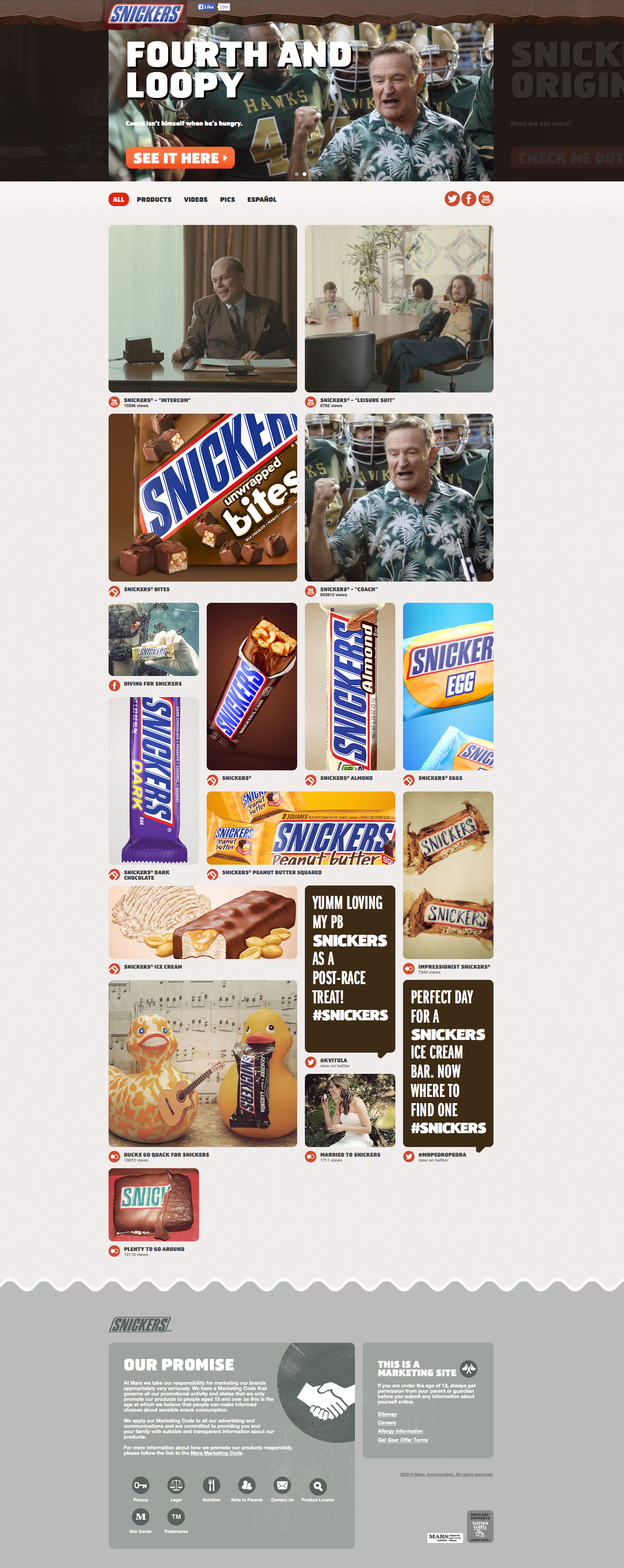
Snicker’s site by Ricardo Landim employs a jagged border at the top emulating chocolate, wavy bordered sections emulating the wrapper, and also overlapping elements all while still maintaining a basic underlying structure to each section: one column up top in the featured area, three in the main content area, and two in the footer.
3. Angled Sections
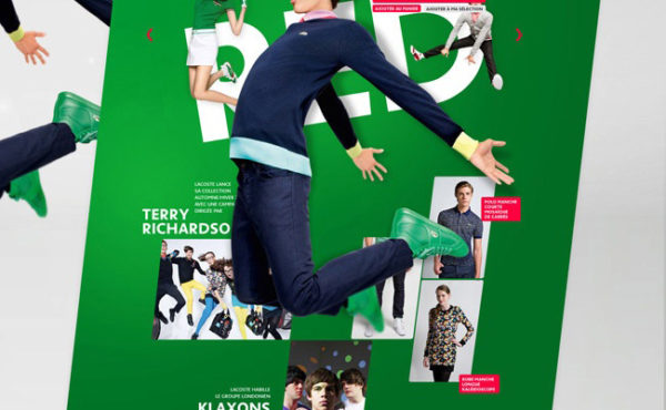
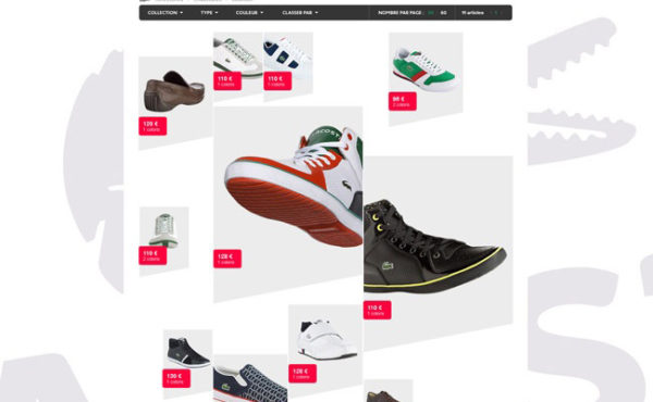
Changing the angle of one or two sides of a shape or section can give a website an incredible amount of character. In this Lacoste concept by Julien Bailly, it was utilized throughout the entire website as a concept of sorts, but even employing something like this just once where appropriate can elevate your grid based website design and help it to break free from the grid slightly.
4. Divergent Background Elements
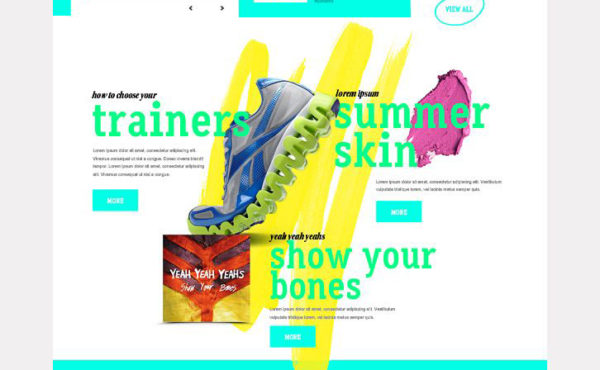
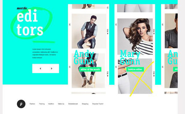
Like many of the other examples, this online magazine website–Young Reborn by Isabel Sousa–also utilizes a number of the techniques outlined above, but what we’re looking at specifically with this example are the hand drawn elements in the background behind images and text. Implementing elements like this is an easy way to contrast the precisely defined, squared-off nature of different sections, photos, and buttons. It adds a human touch to the equation, which so often is missing from contemporary grid based website design that is overrun with clearly defined sections, conservative, classic typography, and sharp symbols.
5. Staggered Sections
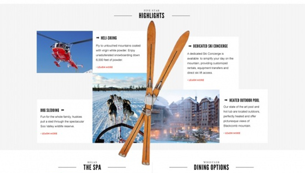
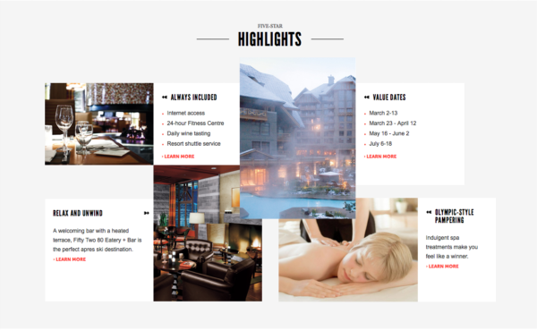
It’s easy for a website to fall into a pattern: rectangular section after rectangular section, after rectangular section. In this example from a Four Seasons website for Whisler Ski Resorts, this underlying structure still exists but the content within some of the sections–like the one shown here–has a distinctly different feel due to the overlapping and staggering of the different “Highlights”. It’s still very modular, but it is visually far more interesting because everything does not appear to be perfectly in line like it is in most other sections.
6. Large/Playful/Hand Drawn Type
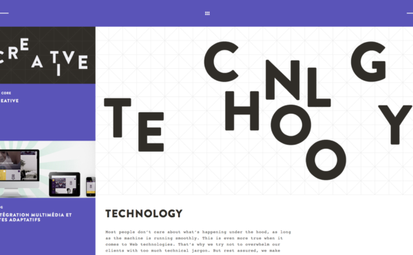
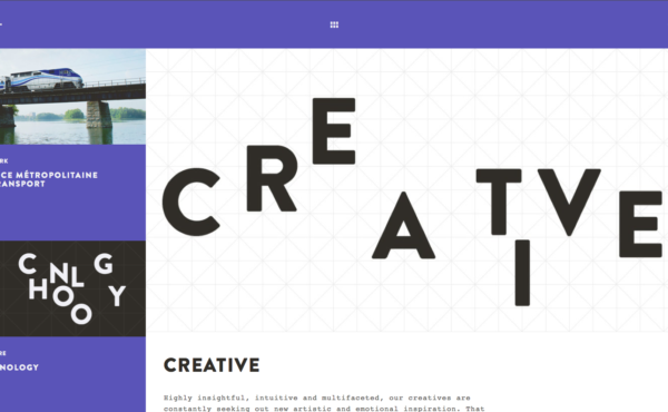
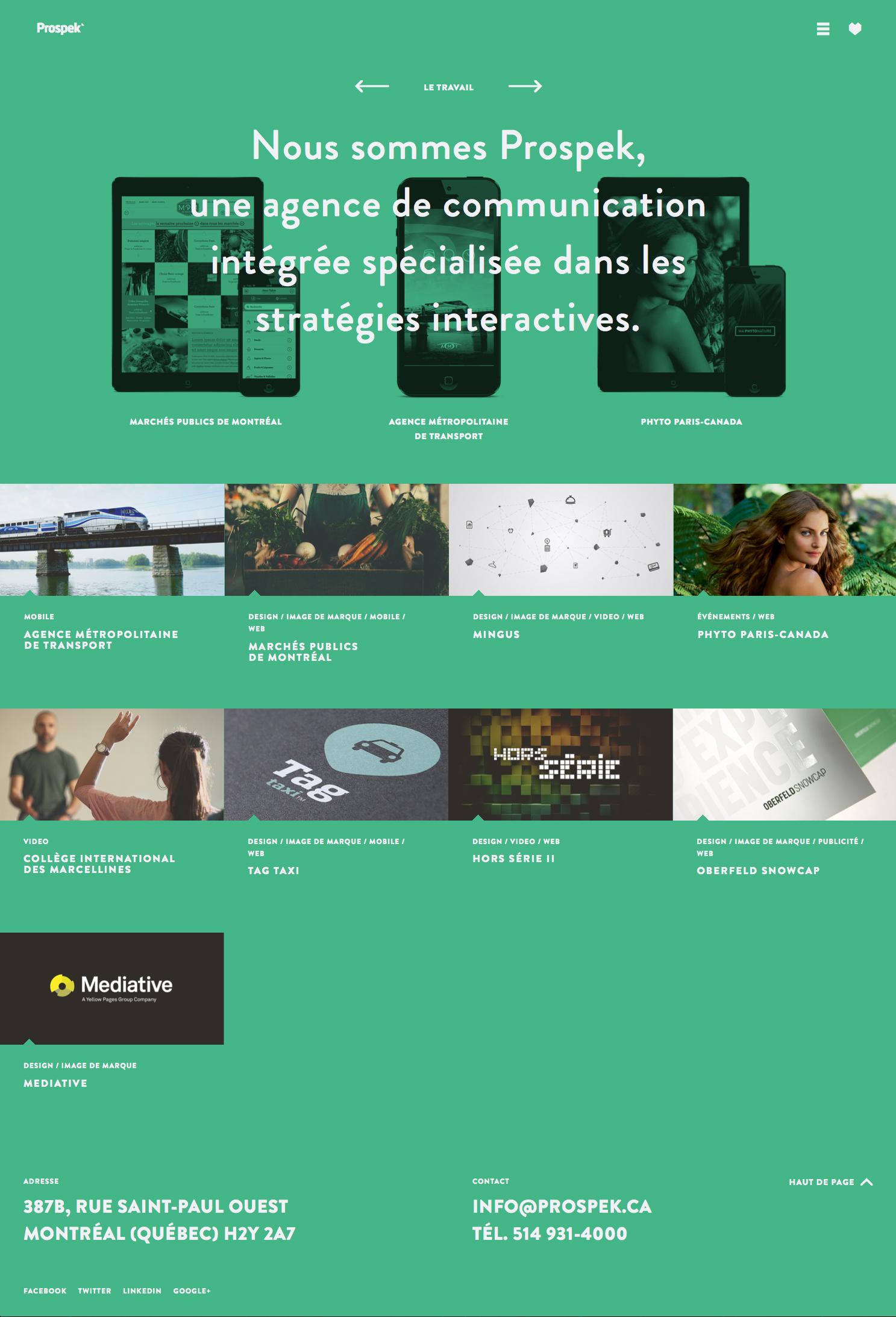
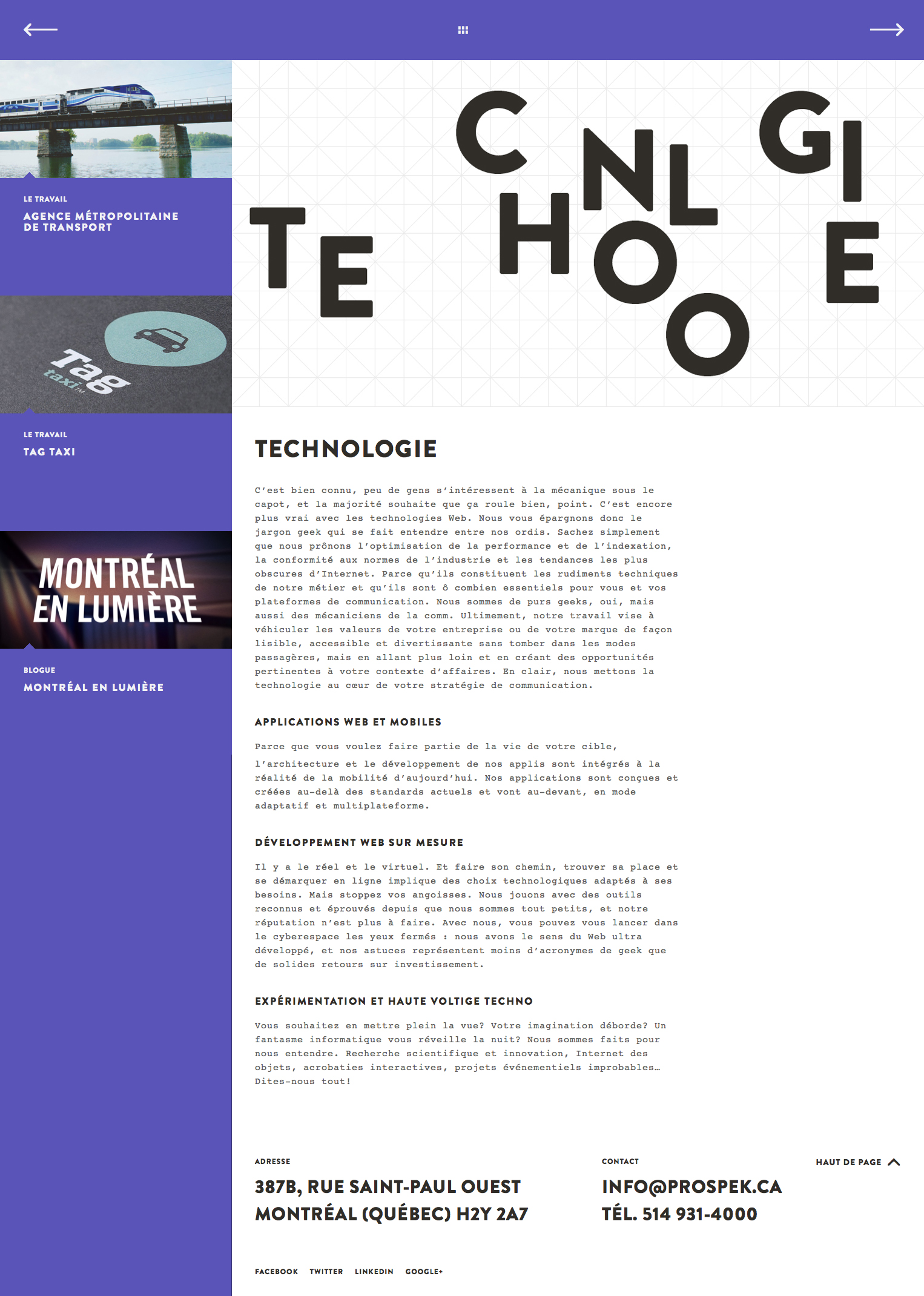
Most typography on the web doesn’t attempt to be expressive beyond a simple typeface change. Anyone who has followed the history of typography in mediums like print surely must be aware that the possibilities extend far beyond that; the examples here from Montreal-based Integrated Communication Agency, Prospek, are proof of that. This entire pages sing because of the playfully arranged “TECHNOLOGY” and “CREATIVE” type; without it, the page would be absolutely forgettable. “Well designed”, but forgettable. The text itself is not being rendered live, as it is a .jpg, but this problem was solved by simply repeating the title below. Don’t let limitations like that keep you from considering this approach. The positive effect to potentially be gained by it is invaluable.
7. Obscured Elements
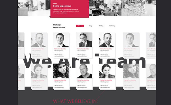
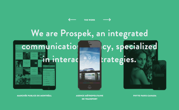
Obscured elements of any kind, whether they be image-based or text-based help to create texture (and therefore, visual interest), and in many cases draw more attention to themselves and the message they are trying to convey. In the top left example, for Bekshta by Alexey Masalov, by obscuring the “We Are Team” text, a sense of connection between each team member becomes much more palpable than it would have had the title been placed fully-in-view and above the isolated boxes for each team member. The meaning is enhanced, and the design of this section is dramatically more interesting because of this placement.
In the top right example, again from Prospek, a very simple obstruction occurs when rolling over one of the three sections/devices. This not only draws more attention to where your mouse is hovering–as it logically should–but also happens to give the page and extra dimension of depth and overall higher visual interest.
It’s easy to go too far and make something unreadable or indecipherable, but if you can find that balance between making it too easy and too hard to decipher, the abnormality of it–especially in contrast to the rest of a website, which likely would be at least relatively structured–can be a powerful interest and wonder inspiring tool. Information conveyed clearly might “communicate”, but it also runs the risk of becoming overlooked if it looks ordinary and unimportant. As the (in?)famous David Carson once said, “Don’t mistake legibility for communication”.
8. Realistic/Hand Drawn Layout Elements
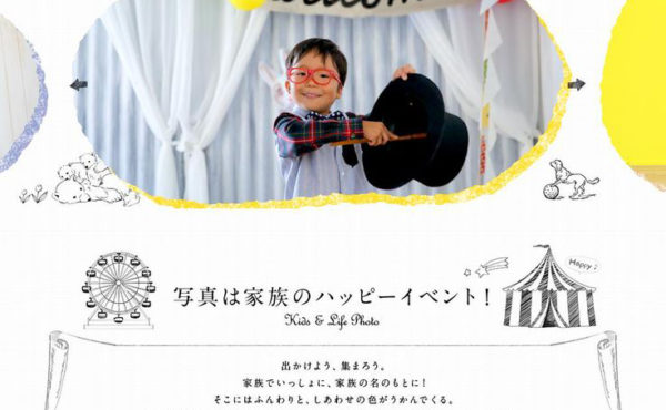
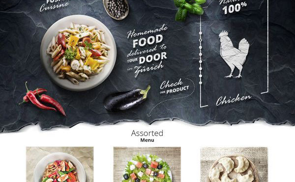
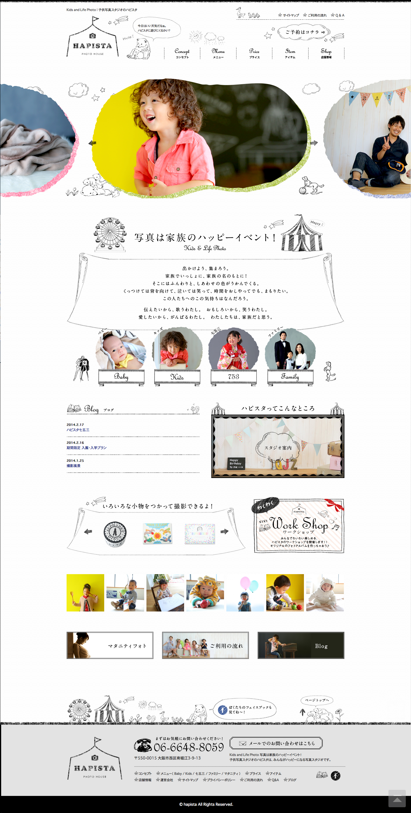
There’s two simple reasons for making use of elements like this. First, it’s for their ability to generate visual interest and inspire connections to the real world, which the ‘content’ itself often is attempting to reference. And second, it’s for their ability to better and more quickly convey a particular message or feeling than text alone can. In this way, they are similar to regular images, but what makes them different is that rather than being seen as an image, they serve a dual purpose and are seen as part of the layout; often first before they are recognized as an “image”. They serve not only to reference the real world, but to assist in presenting the literal text and image-based ‘content’ of the website.
The two above examples: Kompot, Homemade Foot in Zürich by Paweł Skupień and the Happy Photo Studio in Japan both employ elements like this to great effect, enhancing the feeling of their website greatly without necessarily sacrificing the structure.
As designers it is our responsibility to not only to present content, but to present it in a beautiful way (although “beauty” is indeed subjective) so as to enhance what is trying to be communicated. Whether the end users are conscious of it or not, the goal of every website should always be to inspire the person using it to take action and to make connections they might not have been able to make beforehand. Bridging the gap between reliable, though sometimes boring structure and grids, and inspiring, though potentially alienating freedom by considering the use of techniques like these eight is one of the best ways to bring your design one step closer to achieving this and breaking the monotony without breaking the grid in your grid based website design.

