8 Great Examples of Restaurant Website Design 2014
First impressions count, and these days they usually start online. As such we’ve put together a great set showcasing Restaurant Website Design 2014. We’ve been sharpening our design knives and putting our coding hats on to serve up 8 unique restaurant websites for you to devour. Read on to see why we like each site.
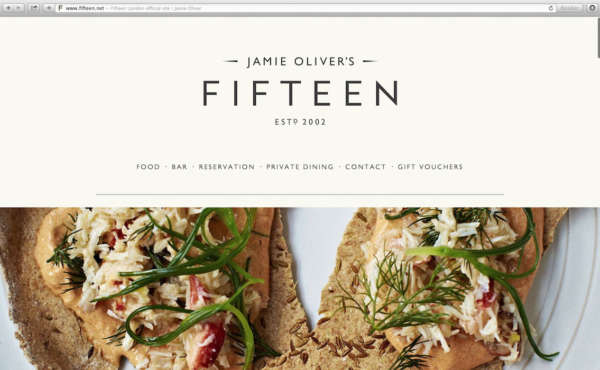
It would be hard to make any of Jamie Oliver’s food look bad, but as always, he over-delivers with this delicious design for his Fifteen restaurant.
- Subtle textures, crisp typography, and a slight parallax effect have us drooling the minute we scrolled
- A well-organized and easy to read menu anchors the page with confidence
- The OpenTable integration, while very useful, teased us because alas, we don’t live in London and won’t make it in time for supper tonight
Extra kudos go to Fifteen restaurant, as it is part of of the Jamie Oliver Food Foundation, with all profits giving unemployed young people a chance to have a better future.
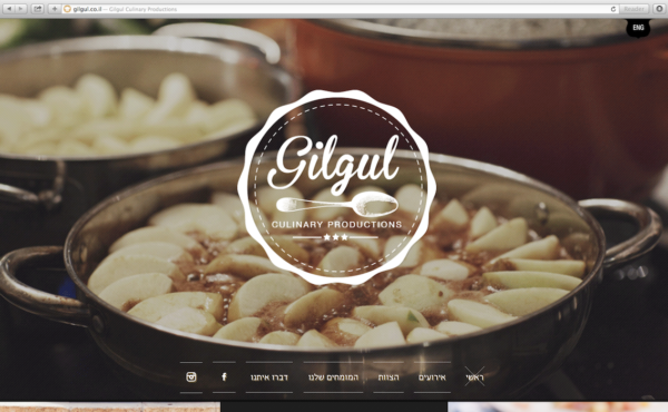
Some culinary ventures focus on fast and cheap, while others focus on skill and experience.
- Motion images add excitement and immerse us into their skillful craft
- Strong use of colour and shape guid our eye through the page
- A truly uncompromised mobile experience make us smile (Way to go devs)
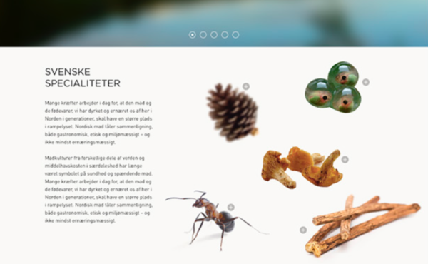
Noma BY NATURE from kasper skov on Vimeo.
With interesting visuals and gorgeous photography, the site ranks high on our design scale and also ranked as one of the World’s 50 Best Restaurants.
- Seamless video integration
- Grid design but use of visual elements break the feeling of a grid
- Atmospheric photography
4) Terroni
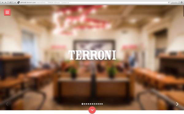
Terroni’s website is simple, clean, and gets to the point very quickly; an essential for their target market of young professionals in a hurry. If you’re social, check them out on Twitter, they are very friendly and always up for a chat!
- Gorgeous OpenTable widget that makes booking a breeze- even on our phones
- Social Media Integration… bring on the food photos!
- The organized menu may have been easy to read, but everything sounded delicious so we were left confused as to what to order
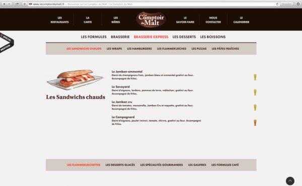
With their use of text, photographs and illustrations, we were able to navigate around even though French isn’t our native tongue.
- Mega organized menu of food and drinks
- Truly mobile and uncompromised experience
- Hidden content; only choose what you want to see
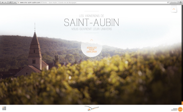
It’s all about the journey for Les Vins Saint Aubin.
- Unique parallax scrolling
- Atmospheric photography
- Layered content flows well
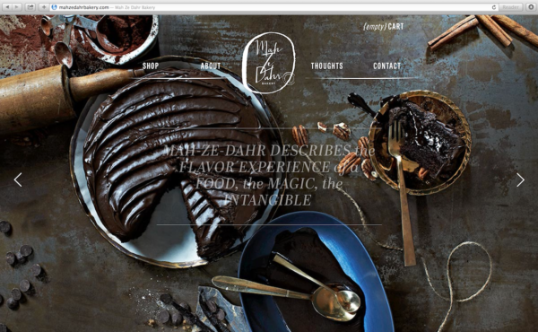
Mah Ze Dahr Bakery cuts through the traditional style of blogs and blends their blog right onto the home page of their website. Based in NYC, they describe their company as a journey of mystery & desire through chocolate, butter, salt and inspiration on their Twitter.
- Unobtrusive home page blog integration
- Beautiful typography
- Crisp photography has us licking our lips… any chance you deliver to Canada?
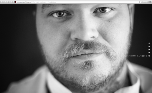
Toronto based Parts and Labour recently launched a new website in 2014. You can tell they have a passion for food through the large scale grid driven photos.
- Social Media integration. Chef Matty Matheson is all over the social scene and the site does a decent job of playing up their social channels. It’s too bad they don’t feature more of Matty’s personal stuff because his Instagram and his series on Vice for hangover cures are both awesome to follow.
- Awesome large scale images. After all they are Toronto’s best burger, and featuring an award like that on their restaurant website should be considered mandatory.
- Mmm. Ok now, I’m hungry. Thank goodness they have a well organized menu design.
Overall I can dig it.


